Home Page
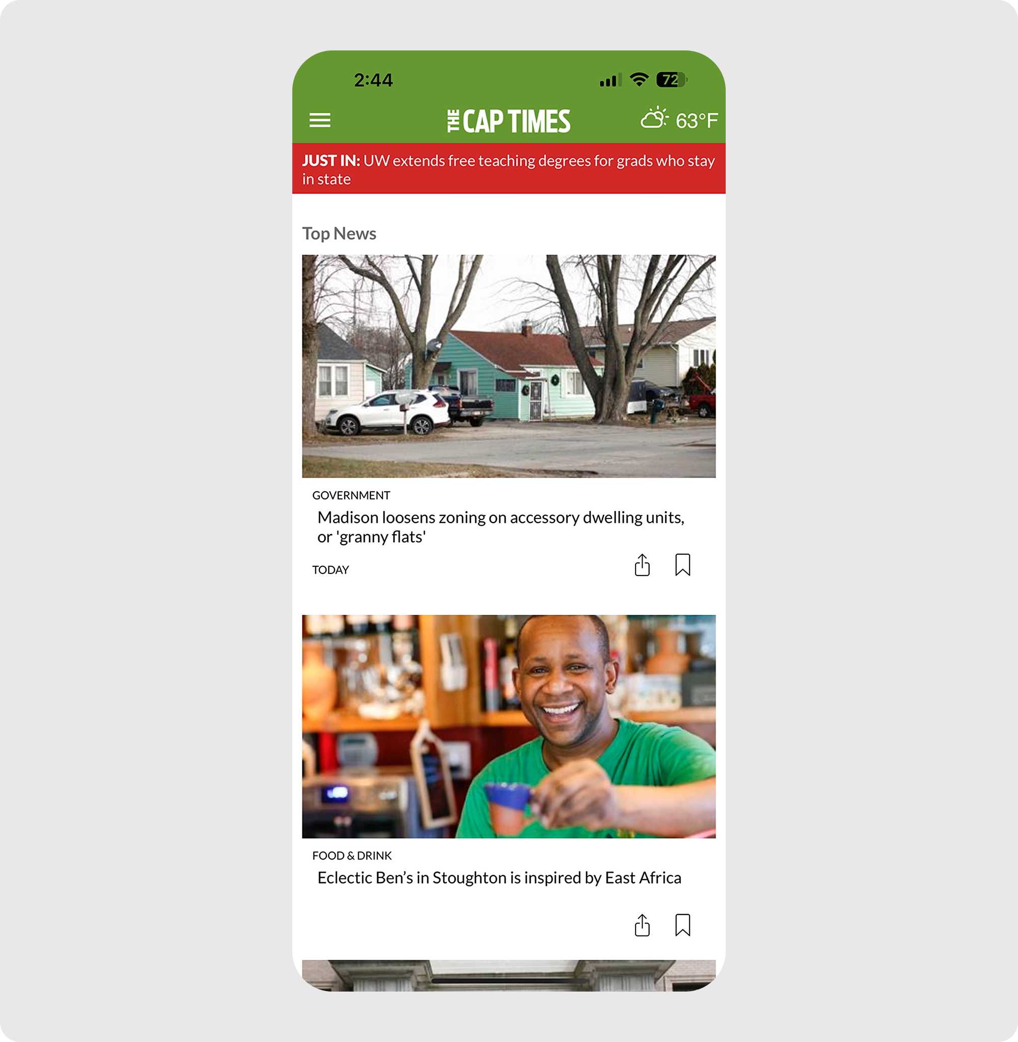
Previously, users were only given “Top News” on the home page, with very little variety of other sections. They had to use the navigation menu to get to any other section.
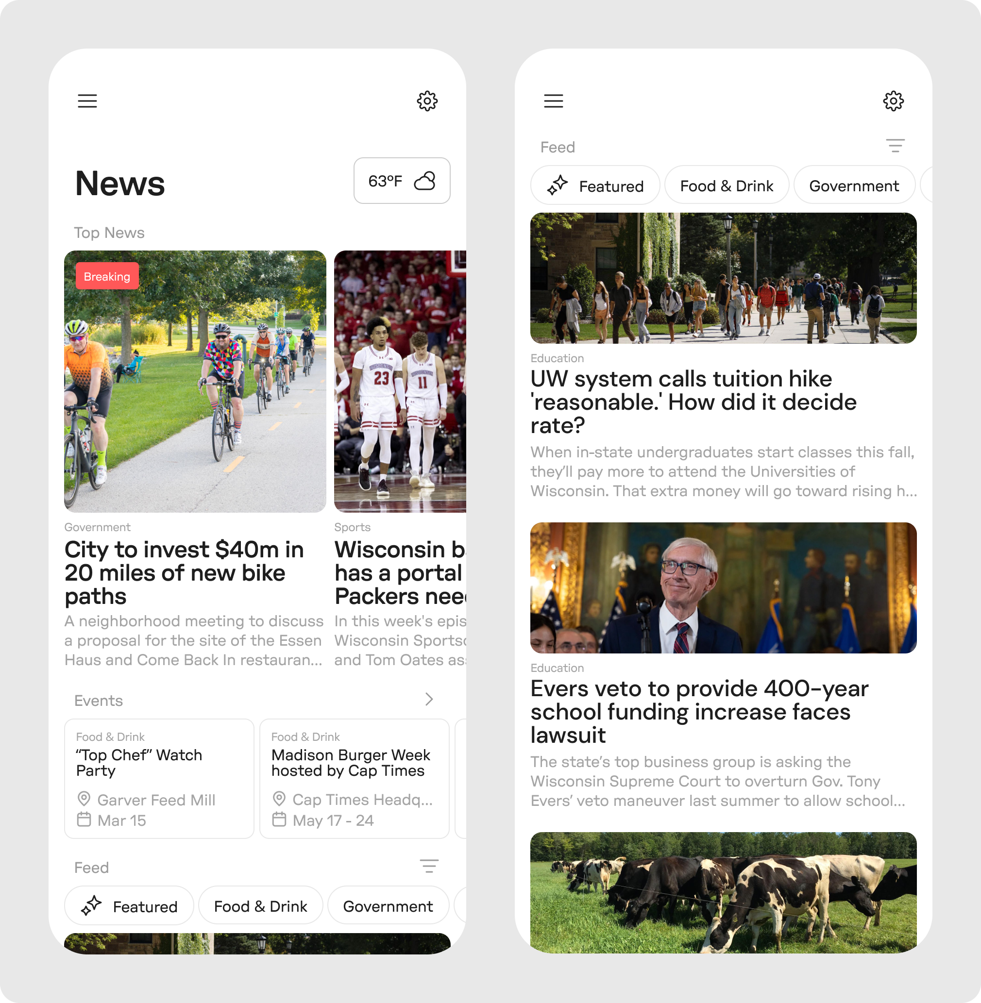
This new approach not only adds variety to the home page with sections like events and top news, but also allows users to quickly filter their feed to the stories they want.
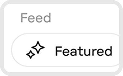
Feed Customization
This new feature allows users to filter their feed by category tags. “Featured” has an icon next to it to differentiate it from other standard categories like “Food & Drink” and “Government”.
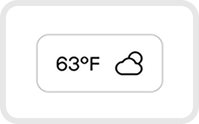
Weather
In keeping with the choice to have the local weather accessible from the home screen, this new weather button showcases the temperature and an icon representing the conditions.
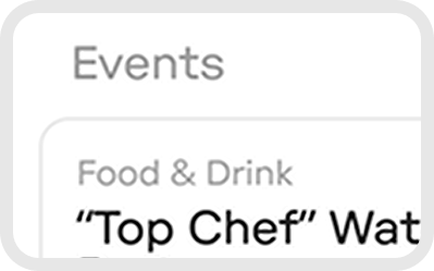
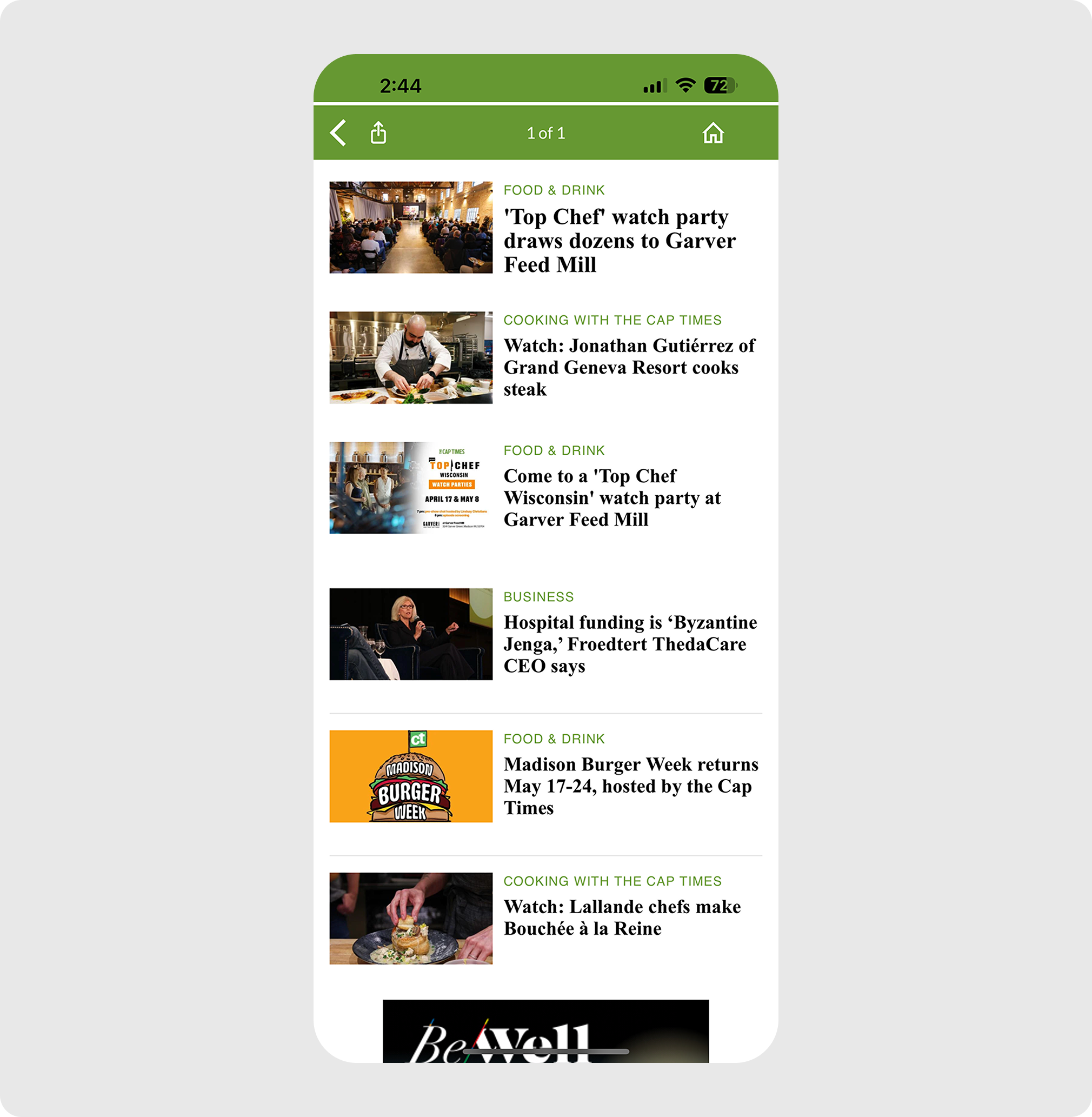
Events
Users can now see upcoming events right on the homepage, without having to navigate through submenus.
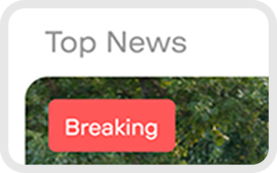
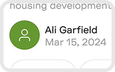
Breaking News
A new tag to alert users of breaking news for ease of access and visibility.
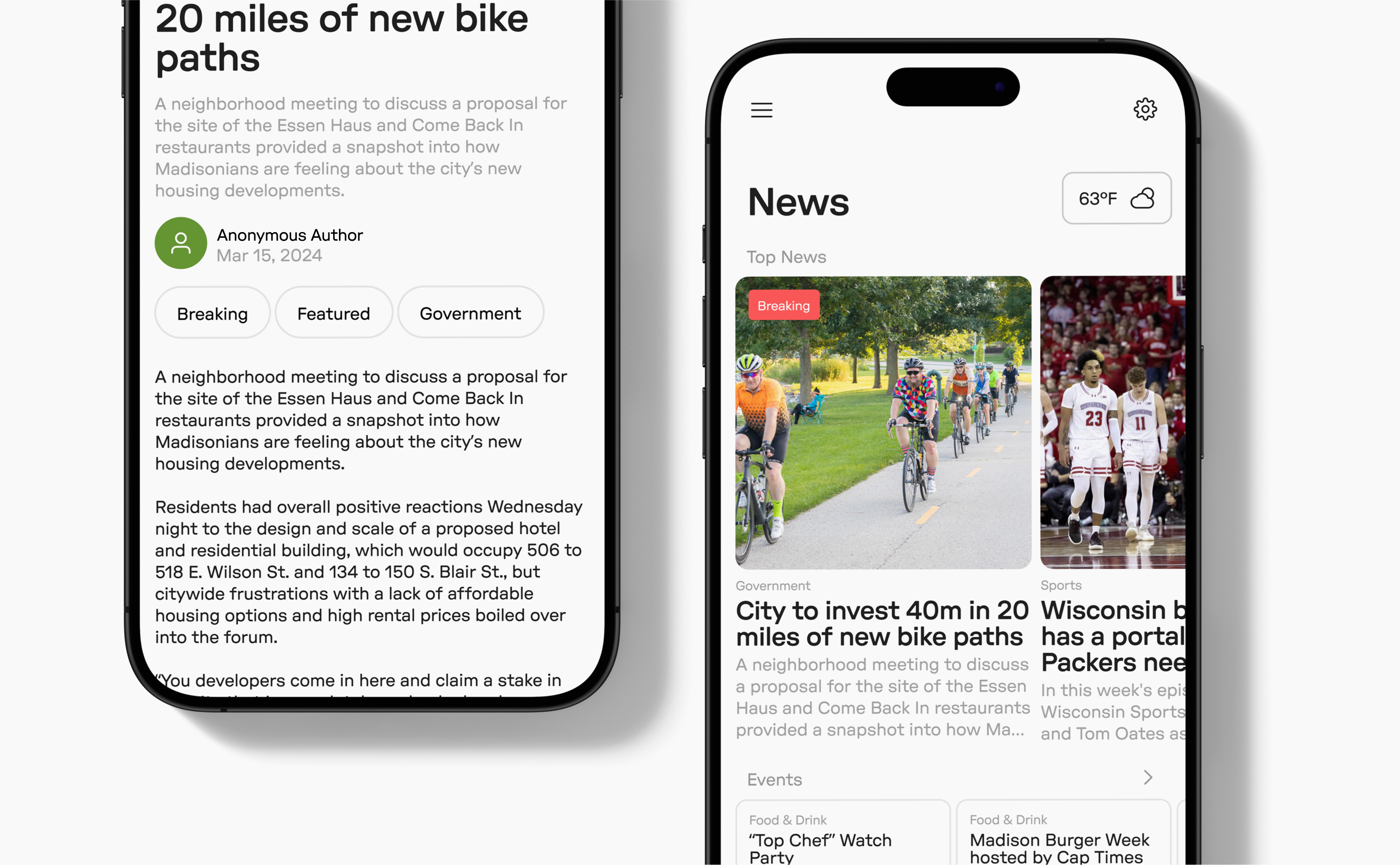
Articles
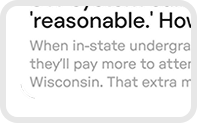
The original article page had inconsistent spacing, multiple non-cohesive fonts, and a lack of links like author and tags.
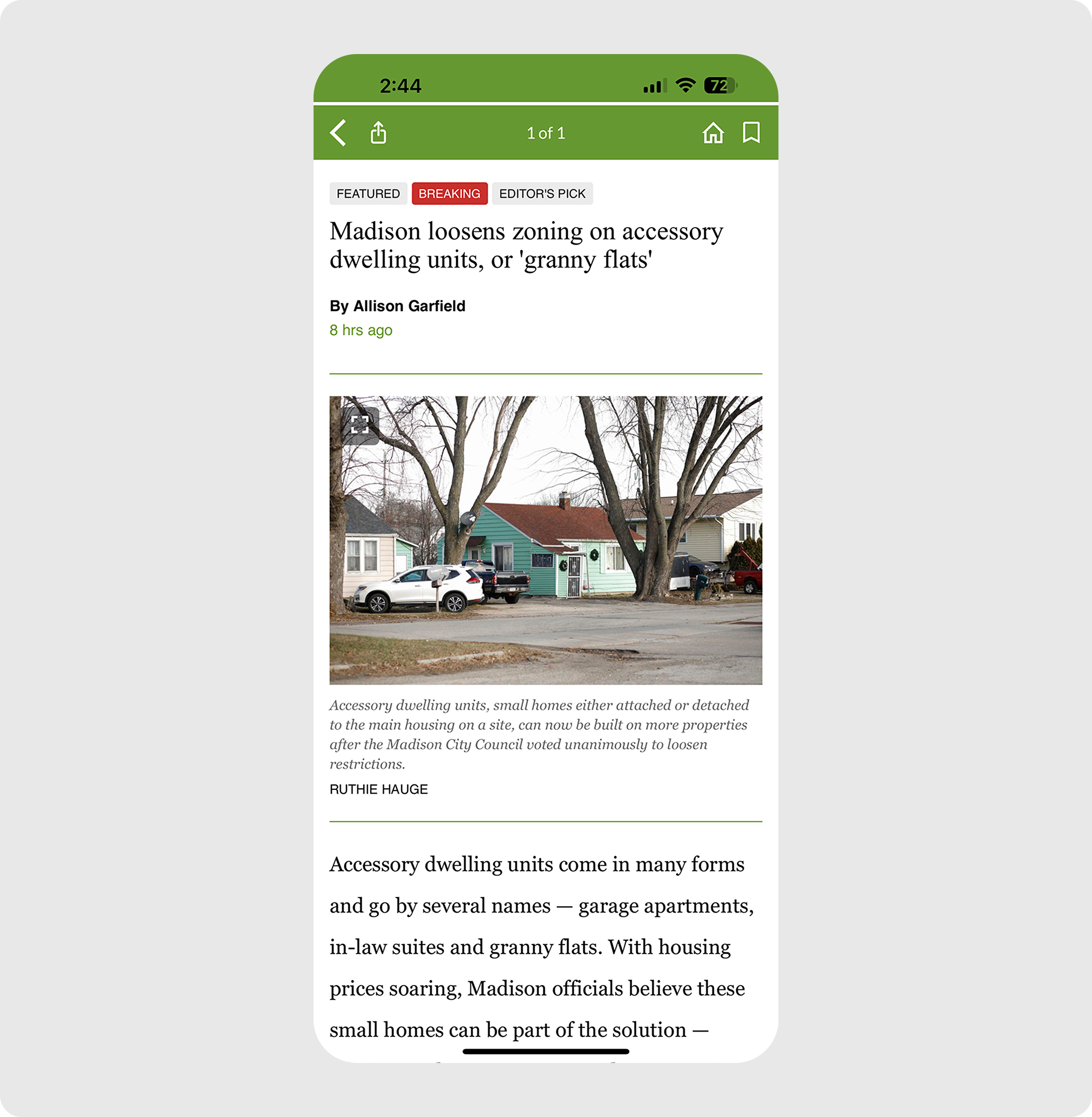
The new article page includes 3 formats: full, vertical card, and horizontal card. Each form includes the main tag, title, and description. The full article also includes more details about the author.
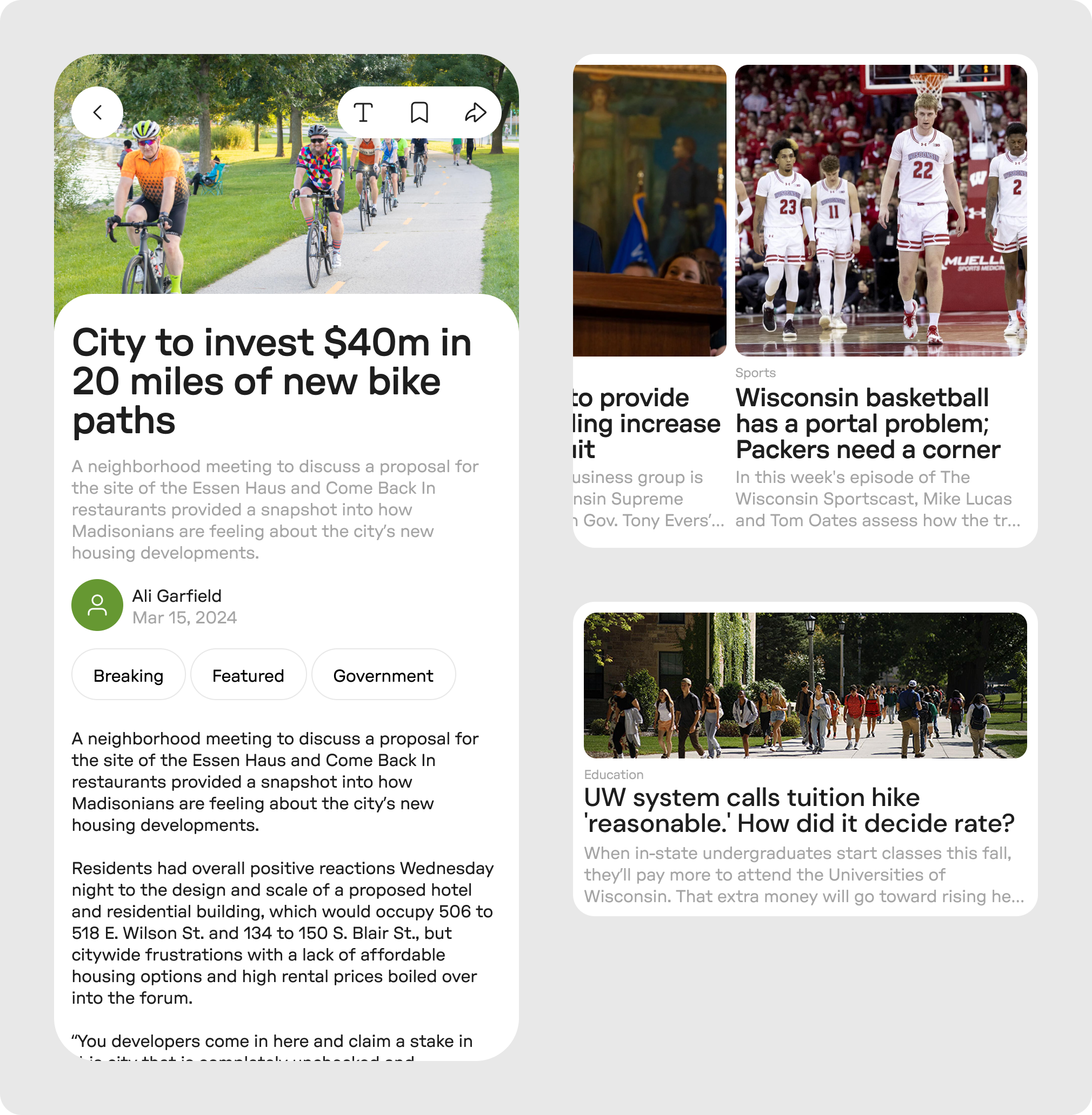
Text Customization, Save, and Share
The new toolbar allows users to edit text formatting settings like contrast or text size, as well as saving and sharing the article.
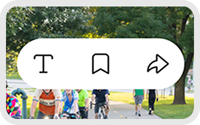
More of the Author
Users can see more articles from the author, as well as biographic information like role and interests.
Category Tags
In addition to providing context about the article, tags also allow users to see other articles with the same tag by clicking.
Article Context
Previously missing, article context can provide a quick preface for users before reading the full article.
Events
Once again, the app uses inconsistent fonts, poor spacing in between events, and random lines here and there that act as dividers. There is also no dates, location, or other information without opening the event.
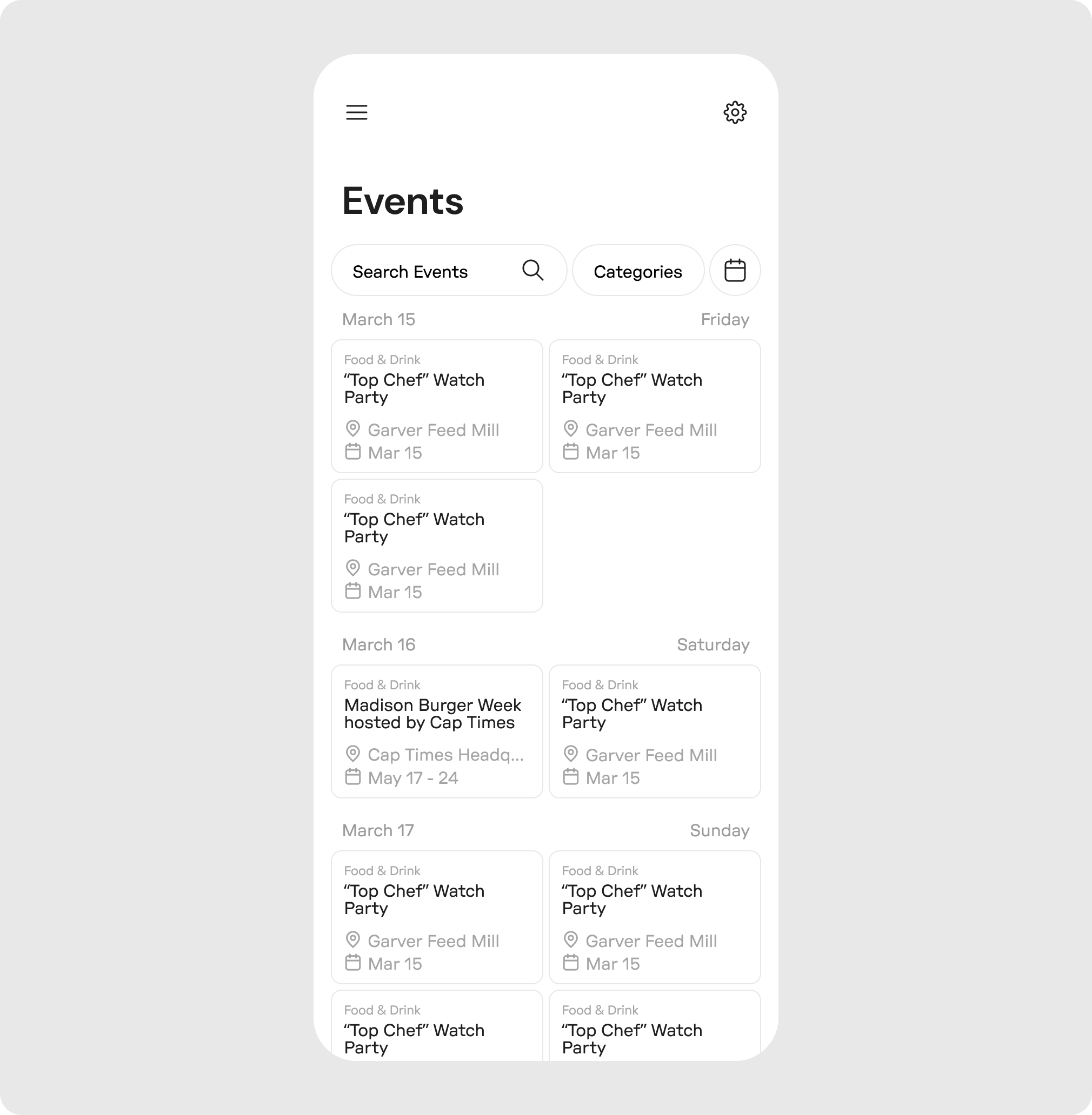
Users can now see all events, with more search and filter functionality. Location and date are more accessible, as well as a calendar view.
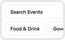
Search and Categories
Users can search for events, or use tags as filters to find the ones they want, or explore new ones.
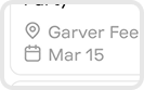
Location and Date
Users can see the location and date at a glance without having to click into the article.